Early Bird Deadline
30 November 2026
Judging
Date
15 & 16 March 2027
Winners Announcement
15 April 2027
30 November 2026
15 & 16 March 2027
15 April 2027


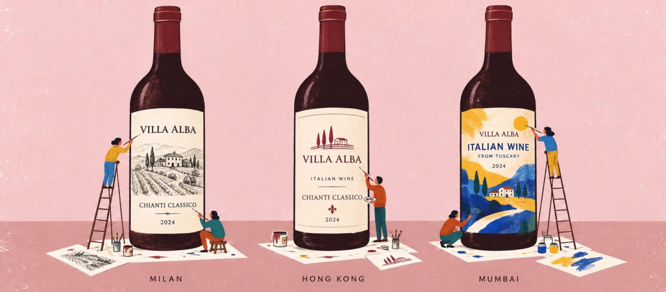
Imagine the same bottle of Italian wine on a shelf in Milan, Hong Kong, and Mumbai. The liquid is identical, the label unchanged. Yet what does that bottle promise to the person looking at it? Heritage, perhaps, or prestige. Curiosity, familiarity, or simply an attractive design. And would those associations be the same everywhere?
This is the question that stayed with me after listening to Vino Visionaries, the podcast hosted by Priscilla Hennekam, and its twentieth episode featuring Marco Baldocchi. Baldocchi, whose work explores neuromarketing and consumer behaviour, is the author of Neurofood: Neuromarketing Applied to the World of Food and Wine. Their discussion of the brain, value, and price prompted me to consider how much of a wine's perceived value is established before we ever taste it.
After all, wine is rarely purchased out of necessity alone. We buy it for pleasure, curiosity, celebration, social connection, or the promise of a particular experience. Alongside price and practical considerations, our choices are influenced by memories, associations, and expectations that we may not immediately recognize.
Before the first sip, the bottle is already doing some of the talking.
A label is more than a surface on which to print a grape variety, an appellation, or a tasting note. Its colors, typography, imagery, and layout create a visual identity that helps consumers imagine the wine inside. The bottle's shape, glass, weight, and physical finish contribute to that first impression, too.
A traditional château illustration may evoke heritage and established winemaking practices. Playful drawings and contemporary typography might suggest informality or experimentation. A restrained design may communicate elegance to one consumer, while another finds it anonymous or uninviting. None of these cues tells us exactly how the wine tastes, yet each can influence the expectations we bring to the bottle.
This is where sensory psychology becomes interesting. Our perception does not operate as a collection of completely independent senses. What we see, read, smell, hear, and touch can influence how we interpret an experience. Expectations can shape what we notice and how we describe it, even when we have no intention of being influenced.
A 2020 study by David Jaud and Valentyna Melnyk, published in the Journal of Retailing and Consumer Services, examined the effect of text-only wine labels compared with labels combining text and images. The researchers found that matching imagery and wording generated more favourable responses, including higher liking, taste expectations and purchase intentions. They linked this to affective fluency: the ease and positive feeling with which we process a message.
In other words, packaging does not necessarily become more persuasive by saying more. It may become more persuasive when its elements make sense together.
That does not mean that a beautiful label makes a wine objectively better. A systematic review by Motoki, Spence and Velasco, published in Food Quality and Preference in 2023, examined 52 studies of visual cues and flavour perception. The findings showed that colour and shape can influence taste and flavour judgments in some circumstances, but results were mixed, with limited or no effects also observed. The influence depends on the cue, the context and the person experiencing it.
The important point is not that the label determines taste, but that taste is experienced within a wider perceptual context.
There is another dimension to packaging that deserves attention: touch.
The thickness and texture of the paper, the resistance of an embossed surface or the weight of a bottle can contribute to a sense of quality before the wine is opened. These physical cues may suggest care, craftsmanship, solidity or refinement, encouraging consumers to infer qualities they cannot yet assess directly.
In a 2018 study, Qian Janice Wang and Charles Spence explored the influence of tactile sensations on wine evaluation. Participants rated a red dessert wine as fruitier when smelling it and sweeter and more pleasant when tasting it while touching velvet rather than sandpaper.
The experiment did not test textured labels, so its findings should not be interpreted as proof that particular packaging materials will improve sales or tasting scores. It does, however, illustrate how sensory experiences can interact. A tactile sensation can influence the way another experience is perceived.
For a producer, this creates an interesting balance. A premium finish might strengthen the intended identity of a wine, but it is not a substitute for a credible product or a coherent brand story. Nor is expensive packaging automatically desirable. The material has to make sense for the wine and the person it is intended to reach.
Wine producers have plenty to communicate: grape varieties, terroir, vineyard practices, fermentation, ageing, sustainability, awards and family history. All may be relevant, but not every consumer needs every detail at the same moment.
An experienced buyer searching for a particular appellation may appreciate technical information. Someone choosing a bottle for dinner might simply want to understand its style, price, and suitability for the occasion. A newcomer may find an evocative name more inviting than a paragraph of unfamiliar terminology.
The question is not whether information matters, but how it is prioritized.
When a label tries to say everything, it can obscure what makes the wine distinctive. A single illustration, a memorable name, or a clear visual identity may establish an immediate connection, while excessive or conflicting information can make the message harder to interpret.
This is not an argument for minimalism as a universal design solution. Technical detail can be precisely what reassures an informed buyer. The challenge is understanding which signals matter to the intended audience and which information helps move a consumer from curiosity to choice.
Our responses to these signals do not always begin with conscious analysis. We may be attracted to a bottle before we can explain precisely why, then use its origin, grape variety, or price to evaluate our initial impression. Intuitive responses and deliberate reasoning work together; consumers are not simply irrational buyers controlled by packaging.
But they do not necessarily analyse every detail, either. A wine label has only a limited opportunity to communicate before another bottle catches the eye.
Now imagine that bottle of Italian wine travelling from Milan to Hong Kong and Bengaluru. The liquid remains unchanged, but the person encountering it brings a different collection of experiences, associations and expectations.
An appellation familiar to an Italian buyer may be unfamiliar to someone discovering European wine for the first time. An illustration of a historic estate could suggest authenticity to one consumer, while another might simply see an attractive image. References to craftsmanship, tradition and origin may carry different meanings depending on a person's familiarity with wine and the cultural context in which it is encountered.
Research published in the International Journal of Research in Marketing in 2020 offers an illuminating example. Franck Celhay and colleagues investigated how Chinese consumers interpreted imported wine labels. Their findings suggested that graphic designs using visual signs with a recognizable connection to the intended message were more likely to communicate the brand's meaning successfully, even among consumers unfamiliar with the culture behind it.
This complicates the familiar assumption that a brand must either standardize its packaging globally or redesign it for every market. Some visual meanings can travel across cultures, particularly when the relationship between the image and the intended message is understandable. Others may rely on knowledge that cannot be taken for granted.
Nor should we assume that everyone within a country responds in the same way. Age, wine knowledge, purchasing power, social setting and the occasion for which the bottle is being bought can be just as relevant as geography.
For an international producer, the question is therefore not simply whether a label looks attractive in different markets. It is whether consumers understand what it communicates, recognize its relevance and form expectations that correspond to the wine itself.
A bottle travels easily. Its cultural meaning may require a little more work.
[[relatedPurchasesItems-68]]
For a producer, the commercial journey begins with attention, but attention alone is not a sale. The packaging must give consumers a reason to engage, create an appealing expectation, and make the wine feel relevant to a particular person or occasion.
A striking label might encourage a first purchase. A coherent visual identity can communicate positioning, reinforce perceived value, and make a brand easier to recognize. But purchase intention is not the same as a completed sale, and an attractive package cannot compensate indefinitely for a wine that fails to deliver the expected experience.
Price, availability, reputation, and familiarity remain important. So does the relationship between what the packaging promises and what the consumer discovers in the glass.
If the wine confirms those expectations, the first purchase may become the beginning of a relationship with the producer. If the experience contradicts them, the same packaging that attracted the consumer may eventually undermine trust.
For wineries selling internationally, understanding this relationship means looking beyond whether a label is noticed or admired. It means asking what consumers infer from it, what they recognize, what remains unfamiliar, and whether the message gives them a meaningful reason to choose the wine.
Ultimately, packaging is an introduction, not a substitute for the product. It cannot tell us exactly what we will taste, but it can influence what we expect to discover.
Perhaps that is the real power of a wine label: it creates the first experience of a wine before the wine itself has had a chance to speak.
And sometimes, before we have even pulled the cork, that expectation is what makes us reach for the bottle.
Written by Manuela Lo Conte Dipwset.
Also Read:
How London Wine Competition Judging Really Happens: Quality, Value and Packaging Explained
The Complete London Wine Competition Entry Guide: From Registration to Results
London Wine Competition Launches Exclusive Buyer Market Intelligence Report For Entrants
The 2027 London Wine Competition gives every entrant greater feedback, transparency and commercial insight. Entrants will receive an expanded score breakdown, constructive feedback on how to improve, guidance on how to market and sell their wines, the names of the judges who tasted their entries, final feedback from the Head Judge and a Buyer Market Intelligence Report.
Enter your wines in the 10th edition of the London Wine Competition.